Athens Paper Co. is a paper goods brand focused on quality materials and thoughtful presentation. The goal of this project was to create a visual identity that felt established, refined, and versatile across packaging and printed materials.
ATHENS PAPER CO.
Brand Identity & Packaging Design
OVERVIEW
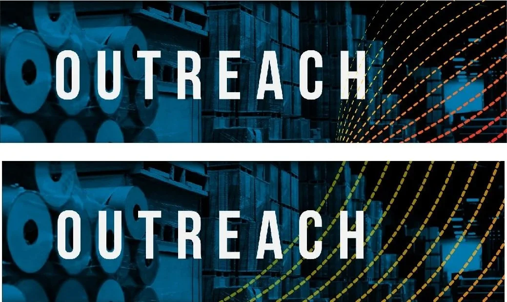
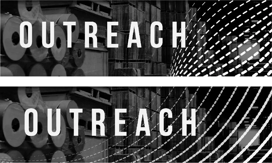
Athens Outreach Graphics

THE OUTCOME

THE APPROACH
I developed a brand identity centered on clarity, balance, and restraint. The system focused on strong typography, subtle detailing, and flexible layouts that could adapt across packaging and print applications without losing consistency.
Key considerations included:
Scalability across different product sizes
Print-friendly layouts and color usage
A visual tone that supported the brand’s premium positioning

BRAND STANDARDS
THE APPROACH
I developed a brand identity centered on clarity, balance, and restraint. The system focused on strong typography, subtle detailing, and flexible layouts that could adapt across packaging and print applications without losing consistency.
Key considerations included:
Scalability across different product sizes
Print-friendly layouts and color usage
A visual tone that supported the brand’s premium positioning
THE SOLUTION
The final identity system included:
A primary logo and supporting marks
Packaging layouts adaptable to multiple products
A cohesive typographic and visual language
The result was a unified brand presence that could grow with the company while remaining recognizable and professional.
Athens Paper Co. needed a cohesive visual system that could:
Communicate quality and craftsmanship
Work across multiple product formats
Feel timeless rather than trend-driven
The brand needed to stand out on shelves while remaining clean and understated.


The completed identity provided Athens Paper Co. with a clear visual foundation for packaging and future brand materials. The system was designed for real-world use, ensuring consistency across printed goods and customer-facing applications.